Cursed Energy
BRAND + PACKAGING DESIGN
The goal of this project was to create branding and product design for a pop culture-inspired energy drink brand. I chose Jujutsu Kaisen as the inspiration. The energy drink brand, Cursed Energy draws from the anime's power system, “cursed energy.”
Deliverables
Custom logo design, product packaging for four drink flavors, and a box design.
Programs Used
Adobe Illustrator & Photoshop
The Challenge
The challenge was to develop an energy drink brand that resonates with fans of Jujutsu Kaisen without using explicit imagery of the characters or logo.
This design needed to reflect the essence of Jujutsu Kaisen without violating any copyright laws. Balancing these elements required a creative approach that appealed to both niche fandoms and the broader energy drink market.
Target Audience
Jujutsu Kaisen Fans
These are anime enthusiasts who are familiar with Jujutsu Kaisen, who would be drawn to the drink because it references the series’ concept of “cursed energy.” This audience may view the drink as a collectible or a fun way to engage with the franchise, even if they’re not regular energy drink consumers.
Existing Energy Drink Consumers
This group includes consumers who purchase energy drinks regularly. They might not recognize the Jujutsu Kaisen connection, but the striking logo, sharp visuals, and intense branding appeal to their preference for energy drinks and offers an exciting aesthetic that fits seamlessly into their lifestyle.
Research & Conceptualization
To understand the energy drink market, I analyzed successful competitors like Red Bull, Monster, and Reign. These brands are known for their dynamic marketing strategies, bold packaging, and emphasis on performance and lifestyle.
For the branding, I was inspired by the visual design of characters using cursed energy as pictured. The blue and assymetrical shape of their energies make for a visual-striking design theme to use for a potential logo while also being unique to the Jujutsu Kaisen universe.
Logo Design Process
I began designing my custom logo by sketching a concept inspired by the neo-tribal aesthetic, a trend popular among Gen Z. My goal was to create a bold design with sharp edges, aligning with the aggressive branding seen in energy drink giants like Monster and Reign. Using the typeface "Cyberpunks" as a foundation, I reshaped the letters in Illustrator with the selection and pen tools to closely match my initial sketch.
For the final logo—shown on the left—I designed a custom capital "N" since the typeface lacked one, and incorporated cursed energy-inspired marks to tie the design to the Jujutsu Kaisen universe. The result is a logo that feels true to the series' essence while fitting seamlessly into the energy drink market.
Packaging Design
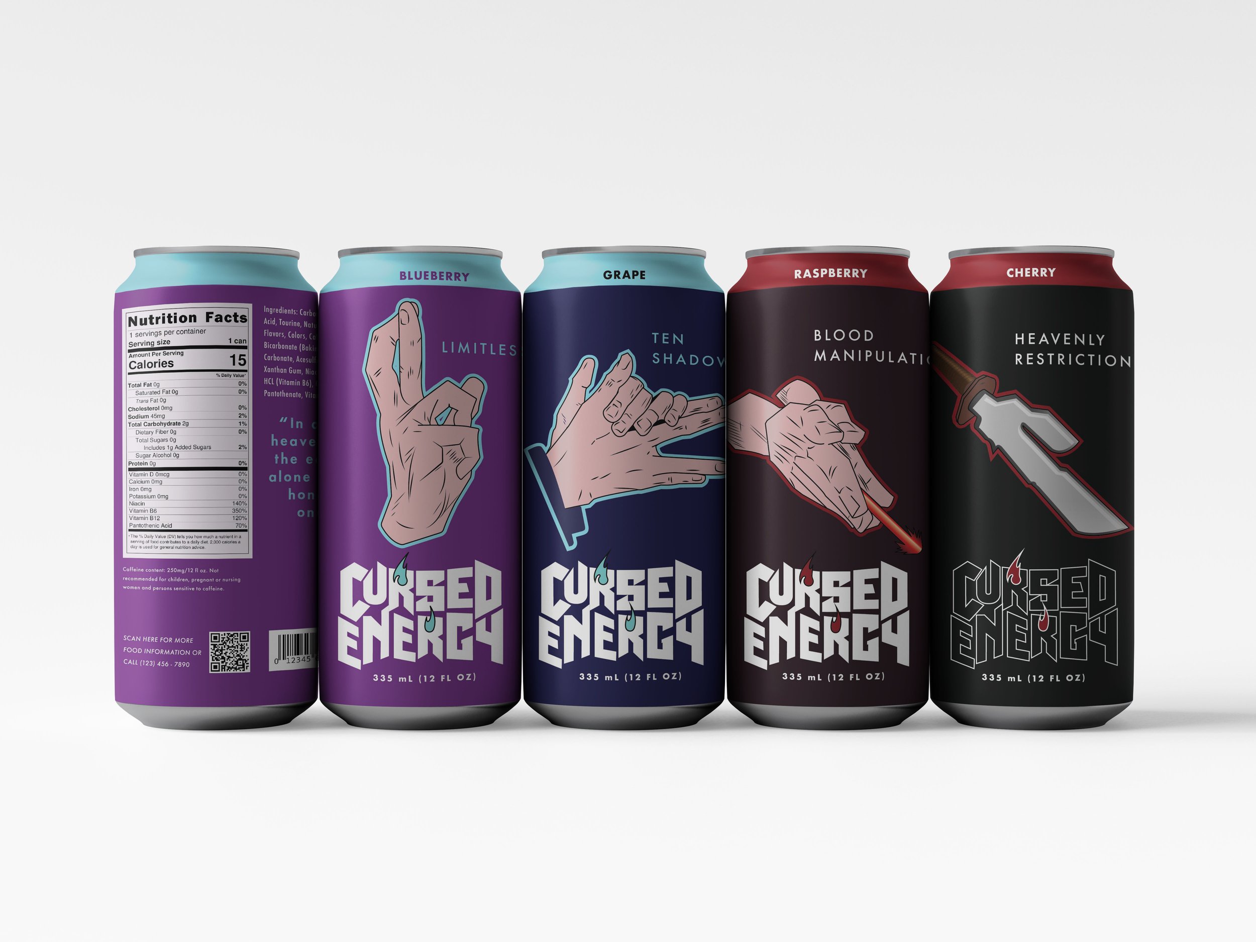
For the packaging design of the four flavors, I utilized a consistent template to maintain cohesion across the brand. Each flavor’s design features unique elements, including distinct color palettes, flavor names, and hand symbols tied to the corresponding character’s cursed technique. To create the hand symbols, I took screenshots directly from the manga and used them as references, sketching and refining them with the pen tool in Illustrator to ensure accuracy and alignment with the brand’s aesthetic.
This approach allowed for a unified yet distinct look for each flavor, tying together the Jujutsu Kaisen theme with a polished, professional design.
Final designs
Each flavor is inspired by a Jujutsu Kaisen character's cursed technique and incorporates the hand sign associated with their abilities.
Satoru Gojo’s flavor, Blueberry, features his hand sign for "Unlimited Void" and uses a color scheme that reflects his techniques, Limitless and Hollow Purple. Megumi Fushiguro’s Grape flavor highlights his hand sign for "Ten Shadows." Toji Fushiguro, known for his "Heavenly Restriction," which grants him unparalleled physical abilities in exchange for having no cursed energy, is represented by a sugar-free flavor to symbolize his lack of cursed energy and reliance on cursed tools. Choso’s flavor, Cherry, is tied to his hand sign for "Blood Manipulation."
The outer packaging design is kept neutral to emphasize the logo and visual elements, with subtle references like Megumi's "Divine Dog" symbol and a quote from the anime, creating an if-you-know-you-know moment for fans. I used Photoshop to create my mockups.
Key Takeaways
The project resulted in a cohesive and visually impactful brand that seamlessly blends anime pop culture with the bold, high-energy aesthetic of traditional energy drink packaging. The custom logo, vibrant flavor concepts, and distinctive packaging design came together to create a consistent and dynamic brand identity.
Through this project, I honed my ability to draw inspiration from popular culture while crafting a design that remains unique and original. It also demonstrated my skill in creating for niche audiences, like anime fans, while ensuring broad appeal to the wider energy drink consumer market.


