
Riverside Art Center — Website Redesign
What’s Riverside Art Center?
Riverside Art Center is a non-profit organization whose goal is to promote fine art and inspire creativity through the arts. RAC serves the greater Wapakoneta area, providing art related, educational opportunities through classes, lectures and demonstrations. RAC also provides a venue for local artists to work, display and sell their artwork.
Client Ask:
I was tasked with redesigning the RAC website, including research, branding, and implementation. I identified 5 main areas of improvement and coded 5 full responsive webpages using HTML & SCSS/CSS. In terms of redesign the website, I focused specifically on intuitive navigation, an artistic modern design, and streamlining content to reduce clutter and improve readability.
Client Goals:
With this new website, the client hopes to increase brand awareness and time spent on the website. They aim to increase engagement for in-person activities & events by 50% through highlighting upcoming events and social media. We also hope to increase the number of memberships with the art center to promote local artists and foster interconnectedness within the Wapakoneta community.
The Details:
Role — UX Designer & Web Developer
Duration — 4 weeks
Responsibilities: Research, branding, wireframes, and HTML/SCSS coding.
Research Process
Pain Points
I identified the following 5 pain points and brainstormed solutions to solve these problems.
Current website lacks intuitive navigation — you have to press the back button to navigate between pages.
Navigation
Visual Design & Layout
Current website design is outdated, which might affect user engagement. A strong brand design needs to be established.
Learning About Activities
The current website doesn’t display events & class. This could increase traffic & community involvement.
Content Overload
Pages are unorganized and text-heavy, which can overwhelm users & make it hard to find information.
Website Responsiveness
Optimizing the website to be responsive can improve user experience on phones & tablets.
Competitive Analysis
I looked at what Riverside’s competitors are doing, like the MET, the MoMa, and the Field Museum. Their designs were heavy on visuals with minimal text with information organized through cards. I screenshotted visual design & UI elements to refer to when creating my wireframes and prototypes.
Design Process
Moodboard & Visual Story
I gathered imagery that I was inspired by for the branding and visual design. All these images have a clear focus on geometric shapes, bold colors, and a minimalistic and bold typeface. The branding should communicate themes of creativity, playfulness, community & togetherness.
Wireframe Sketches
I drew inspiration from both my research and moodboards to create wireframes sketches. Later on, I changed the About page design from the original “timeline” layout so I could reuse components from the Memberships page to allow for faster iteration.
Branding & UI Design
I was heavily inspired by the Bauhaus style for the visual design of the website. The bold colors and shapes help to give Riverside an “artsy” feel while still being simple and modern. I chose cool-toned blues and purples as a call back to Riverside’s connection to the Wapakoneta river.
High-fidelity Wireframes
Here is the final version of my desktop & mobile wireframes.
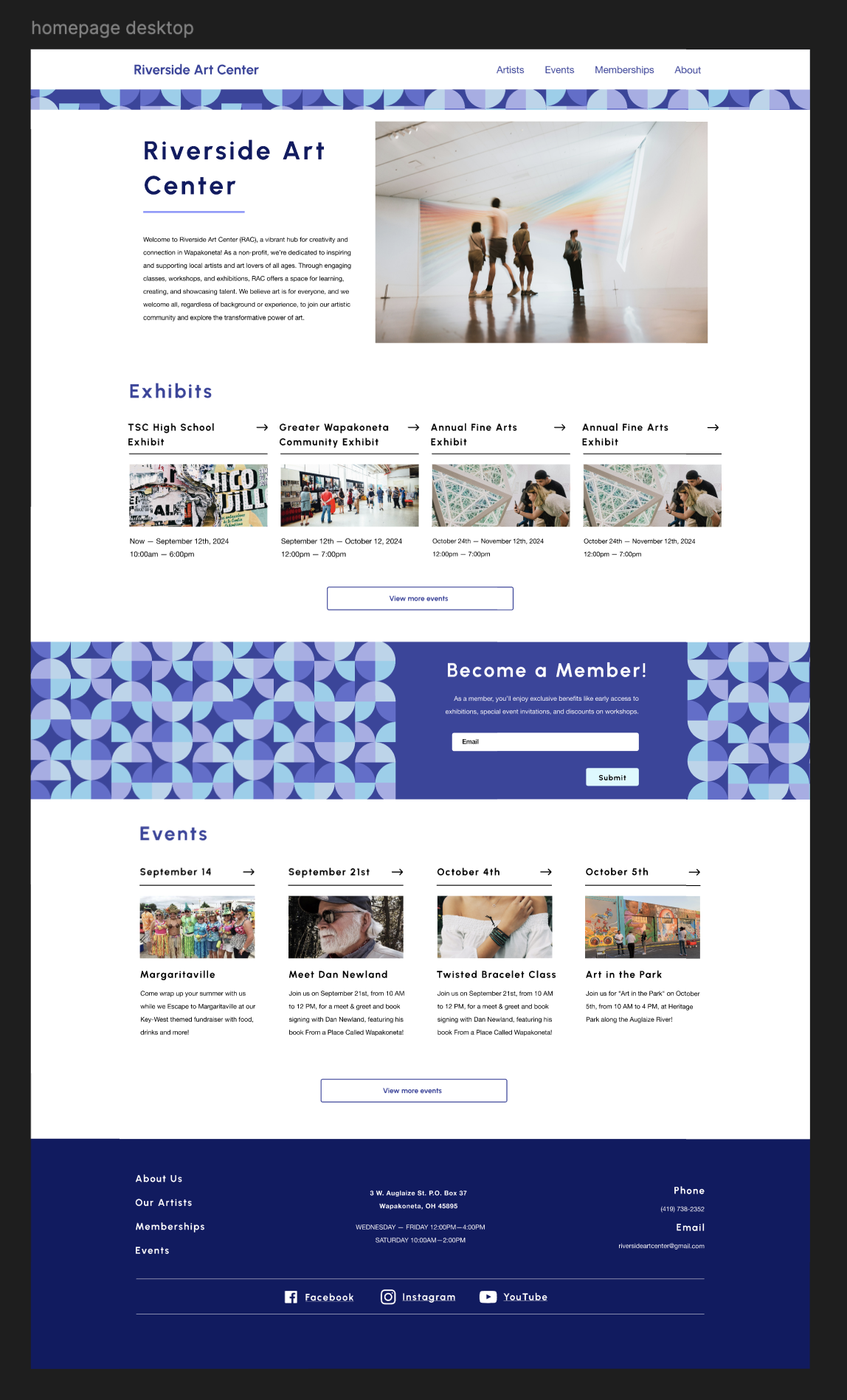
Homepage Wireframe
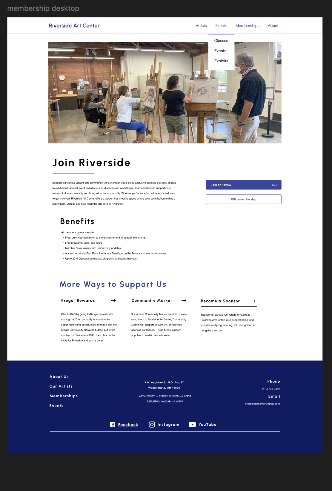
Memberships Wireframe
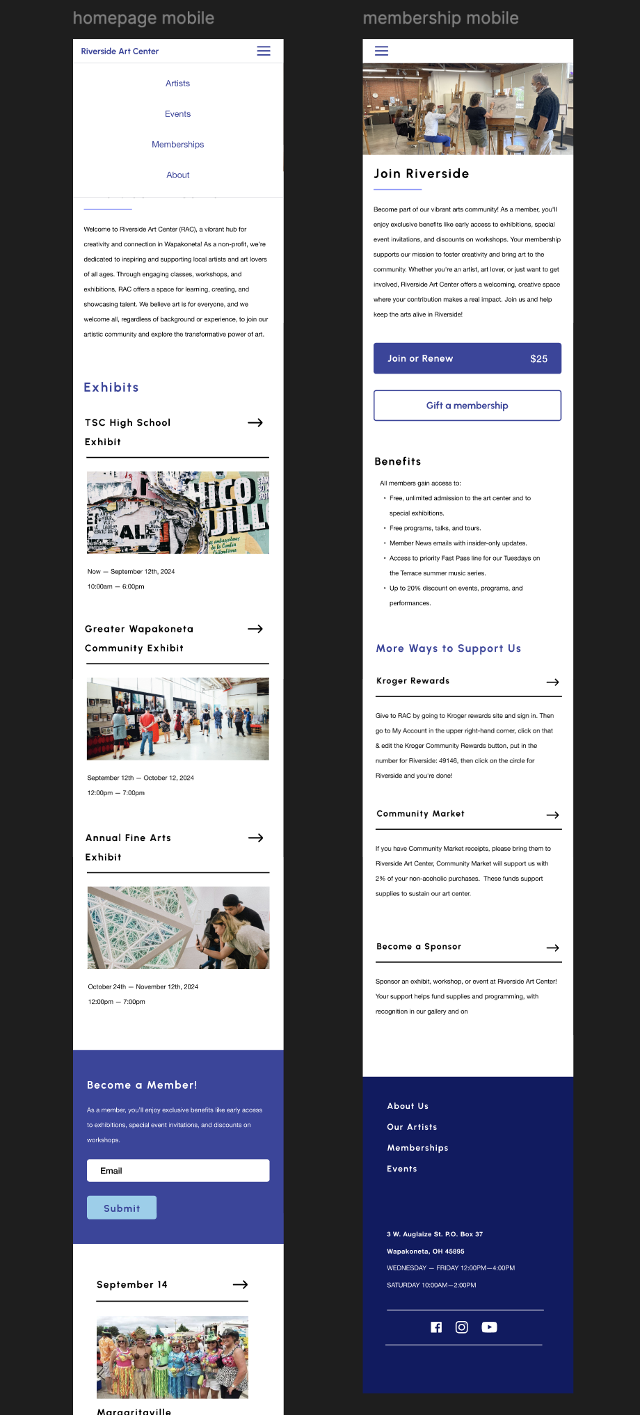
Homepage & Memberships Mobile Wireframe
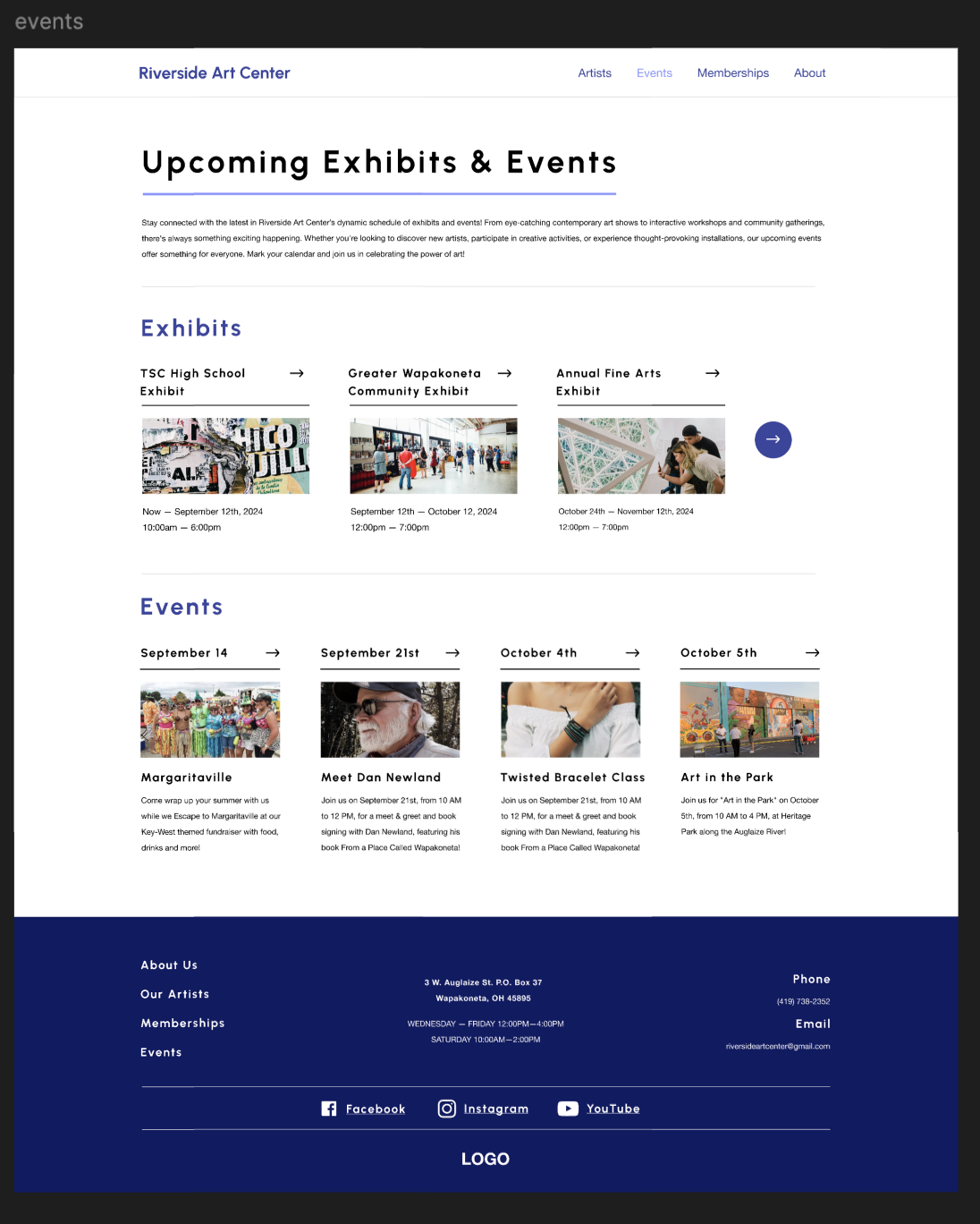
Events Wireframe

Artists Wireframe
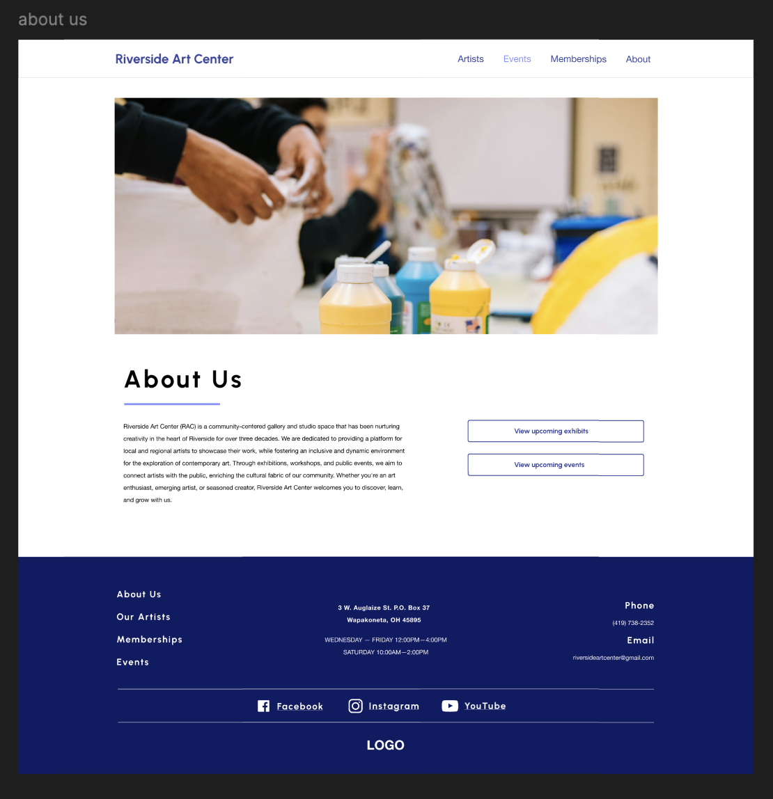
About Us Wireframe
View my code here.
Some of my key takeaways…
I initially started by coding desktop-first, but I quickly realized that a mobile-first approach is easier to code for. I struggled with adapting my design for smaller screen sizes, specifically with the navigation bar at the top.
Overall, this project taught me more about coding CSS/SCSS components and naming conventions to make iterations faster. It also showed me the importance of a design system and creating detailed designs for developers.


